Creative Coding with Generative Colors in 3 Levels
This article was first published in a medium article.
Prelude
Alright, I’ll be honest, I’m not an expert. But I’m no spring chicken either. Still, having started creative coding in 2019, my understanding of color hasn’t grown much.
With so many generative techniques out there like jumpflooding, cellular automata, river erosion, mold slime simulation and so on, it’s easy getting caught up in the challenges of implementing them, getting blown away by the super ultra mega cool visuals that they create and forgetting about color, if not outright avoiding it.
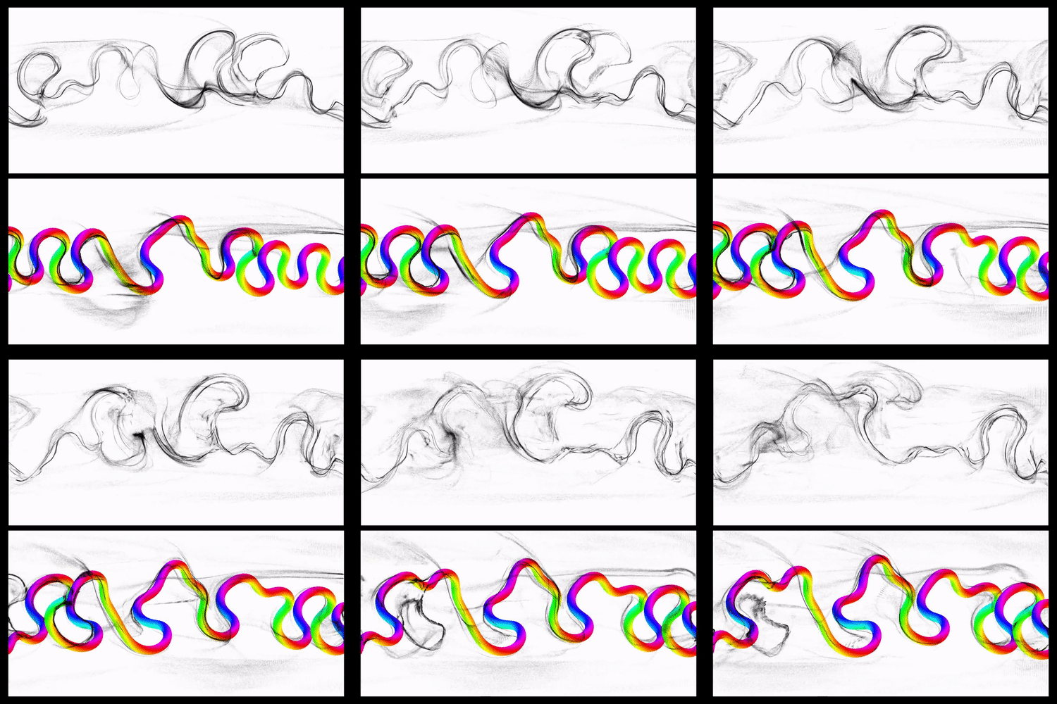
In Tim Rodenbröker’s short blog post ‘Thoughts about Color’, he admits to using his comfort palette of black and white because he feels that the color systems he created were cold and mechanical.
“I have thought a lot about the subject of color during my work as a designer and also during the development of my courses, although I have always intuitively avoided any kind of colorfulness.”
Time Rodenbröker
I share his views too. At least until I came across Quayola’s Transient, a work whose stunning visual effects isn’t just attributed to its crazy algorithms, but to beautiful interplay of colors. Since then, I’ve thought about the work everyday, especially those colors, which have much in common with impressionistic paintings.
Intro
This article is somewhat of a documentation of the journey I’ve made thus far, but also a brief overview of the generative color techniques. I’ve split these techniques up into 3 levels. The word ‘level’ has other connotations too. So to clear things up, I don’t mean that the next level is always better than the last. I draw on the analogy of buildings, where the next level is built on top of the previous.
Level 1: Randomness
Early on in my creative code journey, I learnt that colors on the computer screen are represented by three values: red, green and blue. The next thing I learnt about colors is to randomize these values!
It’s the easiest way to come up with an assortment of colors. You can call a random color function literally a thousand times and you will get a thousand colors. But these thousand colors don’t have anything to do with each other, both visually and conceptually. They’re just … random.
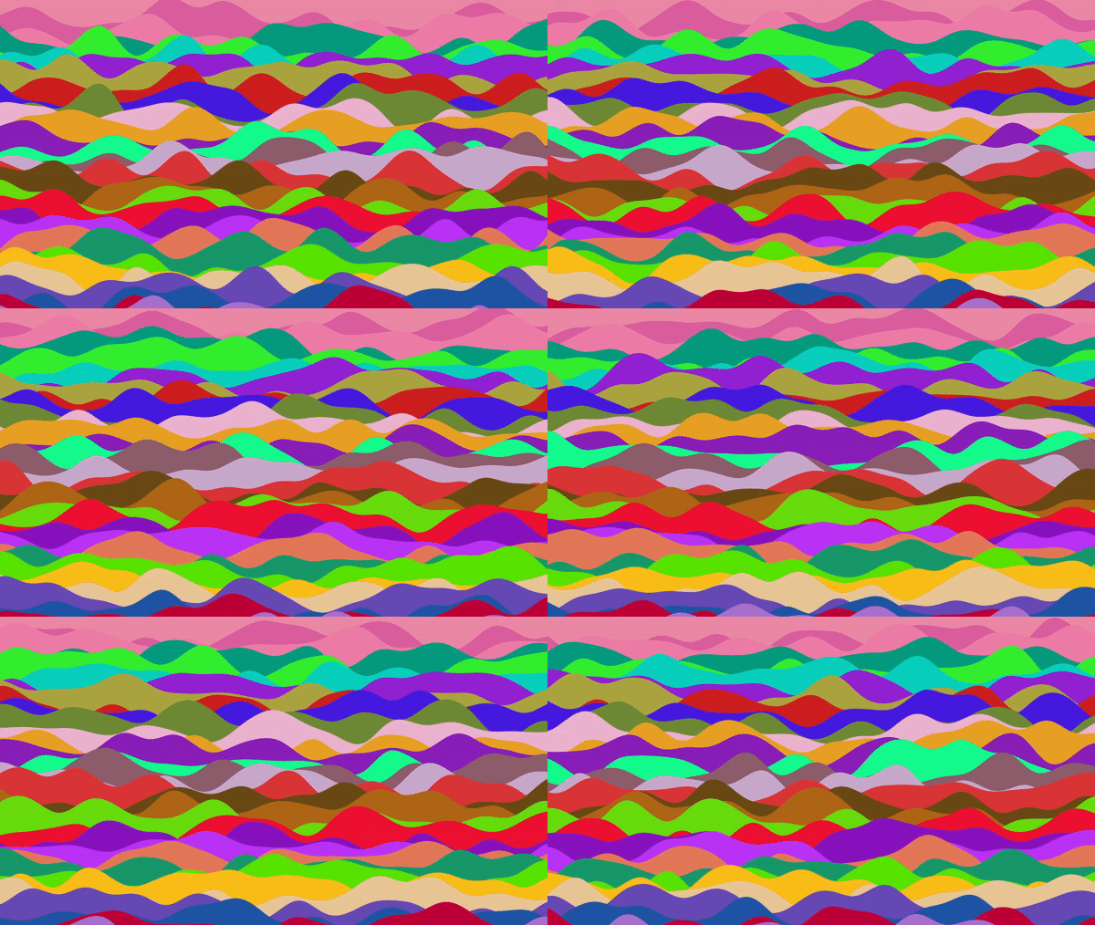
Random RGB does have its merits though. Owing to its ease of use, it’s the technique I most often fallback to when debugging. When multiple objects have wildly contrasting colors, their form is more obvious and has an in-your-face vibe to it. When my school teachers said ‘Watch the colorful language!’ (in the context of me swearing in primary school), THIS is the colorful they are talking about.
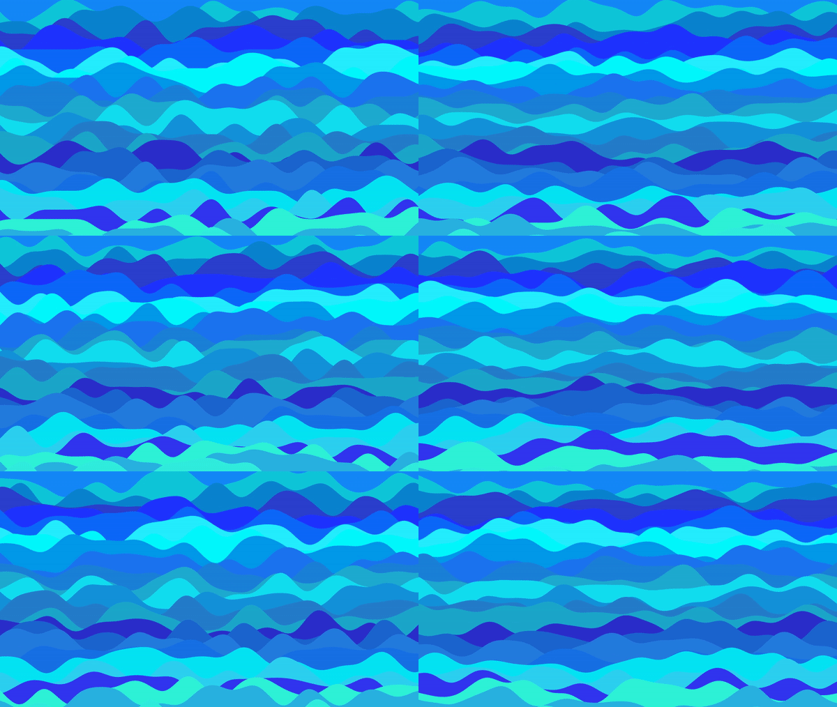
It’s not that difficult to add some context to random colors though. Instead of using the RGB color space, we can use the HSB colorspace. By restricting the ranges of the random values we plug into the hue, saturation and brightness channels, the colors will be closer to each other in visual proximity. You can get different shades of the same hue by only varying saturation and brightness, or get analogous colors by only varying the hue a moderate amount.
The advantage of using random colors is the ease and variation that it creates. However, the disadvantage, which I think outweighs its advantage, is the lack of control over the values. You’re at the mercy of the RNG gods. You could mitigate this by choosing a Gaussian distribution (bell curve) so that you know which values are more likely to appear. But in the end, there’s no way to map a random value to something like time or position in space.
Level 2: Procedural
Phase Shifting
After a while of using black/white and random color schemes, I came across this article by Inigo Quilez. In it, he describes a technique to procedurally generate colors. He didn’t name the technique, but I believe it’s called phase shifting.
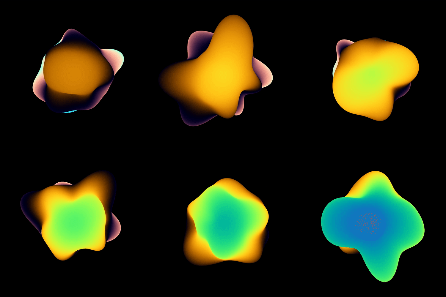
The colors generated by this technique are limited, depending on the parameters. You can generate the rainbow, but you can also generate palettes of complementary colors or monochromatic colors by tweaking the parameters.
When I want to reliably produce a color scheme that is coherent and aesthetically pleasing, I use this technique.
Other techniques: Sampling and Displacement
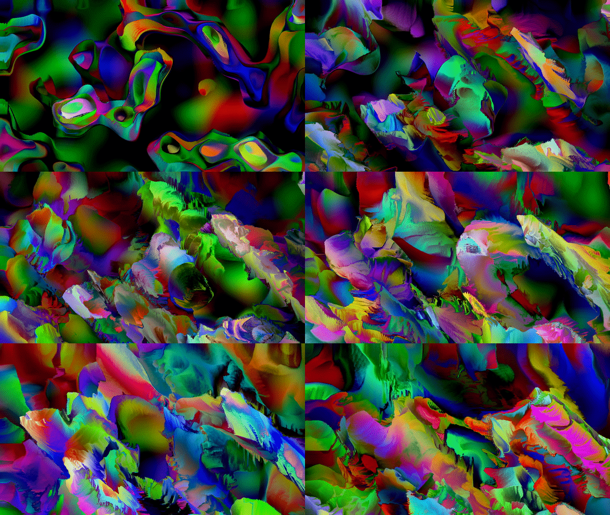
This isn’t a technique to generate colors per se, but it’s a delightful way of mixing up a visually attractive blend of colors. Below is an example where feedback displacement of the RGB channels in a fragment shader creates crazy colors.
Another way to do this is to use a source video and have the underlying video data displace the colors.
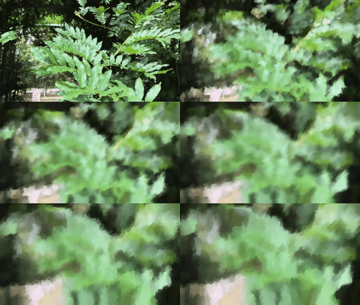
The colors stay in the same palette as the source video, so much of the result depends on the original composition of the video. Practicing this technique has led to me practicing other endeavors like videography and video editing.
Other techniques: Mapping
One more way of procedurally generating colors is to use mapping. For example, a trick I love to use, for example when I’m working with particles, is to map the angle of movement to the hue. The result is vibrant and funky:
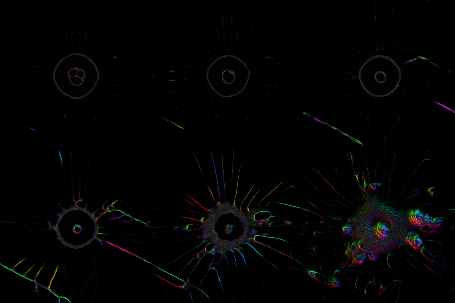
Mapping is a powerful technique with the right combination of parameters and clever usage of color. My choice for using angles of movement and a hue mapping makes the result resemble a normal map. With imagination, these colors will be visually coherent and attractive and still preserve some internal logic.
Procedurally generating colors has saved me the footwork for doing the critical thinking and reflection. At the same time, it has helped me create easily beautiful color compositions with the help of a few parameters. Except for one thing.
I still don’t know how colors work together.
Level 3: Color Theory
I’ve come so far with procedurally generating colors, but it still hasn’t gotten me closer to understanding why Quayola’s Transient looks amazing (seriously, go see it if you haven’t by now).
I decided to revisit art class in primary school. I read up and watched videos on color theory. One concept is central to this: color harmonies. The idea that different colors can form different color harmonies based on their position on the color wheel wasn’t new to me, but it never occurred to me explore these combinations.
Until (there is always an until) I came across an addon for OpenFrameworks (the framework I use) called ofxColorPalette, which enabled me to explore these theoretical combinations. I wrote my own addon ofxSwatch to create palettes (it can create gradients too). With my addon, I created color tables, with multiple rows of different color harmonies to get a better grasp of color relationships.
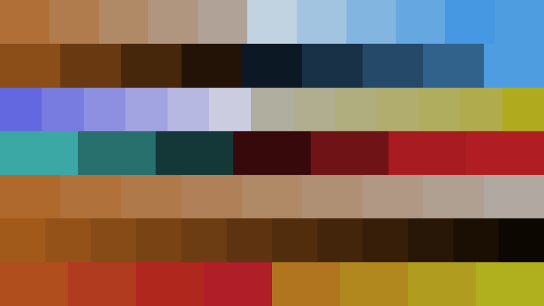
It was such a simple idea! Just like there were multiplication tables to aid understanding the relationship of numbers, I could now make my own color tables to aid my understanding of colors. I was really pleased at this, because when I saw a color combination I liked, I could use that color to generate another color table. Now with two color tables, I could mix and match or even interpolate for a wide variety of tonally matching colors.
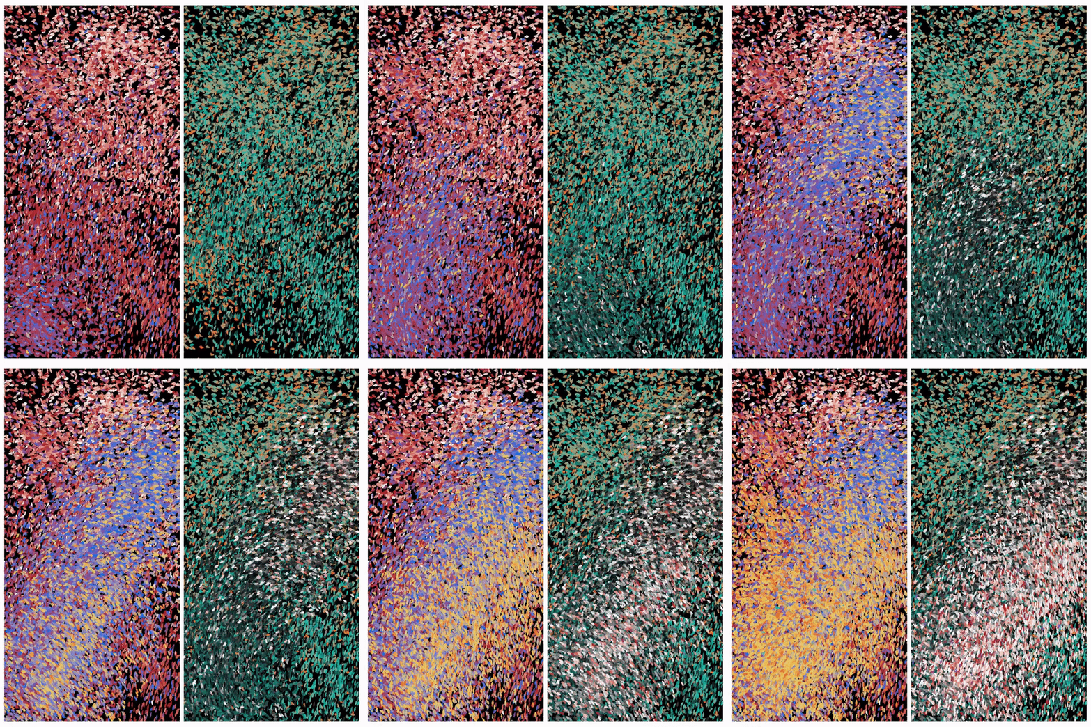
While it was still algorithmic and generative, I know had the choice to pick my own colors and not rely on the math. This basis of color selection was, to me, a more artistically satisfying choice.
What’s the next level ?
So far I’ve only written about how to generate this colors as general approaches. They’re all only techniques. To add to that, these techniques aren’t mutually exclusive. I could easily generate a color palette with color theory but then still resort to using randomness to select them.
There has to be some sort of overarching hierarchy.
One really good rule to follow (it comes from the world of design), is the 60–30–10 rule, where you use your primary colors 60% of the time, secondary colors 30% and accent colors 10%. The terms primary, secondary and accent refers to the color scheme, not color theory.
There are countless rules out there, I’m sure, but they all aim at balance. A proper balance of colors, in their usage and meaning, can lead to a more pleasing composition.
Color is subjective. We are all built different and grew up different. The way we see colors are different. For this reason alone, it’s safe to say that there are no right or wrong ways to use colors. It depends on the context.
The How/Why dilemma
Then there’s also the why. These techniques are only the how. It’s still important to think about the why. There is no way to avoid it. One way or another, we will have to face that colors mean different things in different cultures too. Color is cultural.
For example, red is such an auspicious color and black such an inauspicious one in Chinese culture, that I was forbidden to wear black clothes as a kid during auspicious events such as Chinese New Year or my friend’s granny’s 90th birthday.
Color is political too. In Myanmar, where a coup took place in February earlier this year, green is a hated color as it represents the military. Red, again, represents the NLD (National League for Democracy) party of Myanmar. Since the coup, the meaning of these colors have been heightened. It would be wrong to use the color green in a pro-democracy demonstration in Myanmar.
But these are not reasons to shy away from thinking about colors. Knowing not only the how, but also the why we use colors will bring more depth to our artistry and craft. The things we make will not be cool empty graphics, but will also be creations which mean something to ourselves and others.
Closing
I hope you could get something out of this article! Much of it is personal, but many of the things I’ve learnt has also been personal musing of other artists I respect and admire.